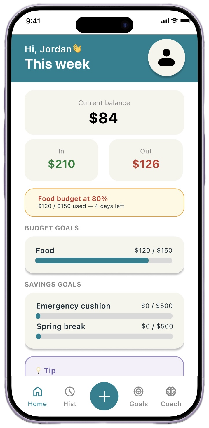
Now live on the App Store
A judgment-free mobile app and responsive webpage that helps students and young adults track spending, set savings and budget goals, and build healthier money habits, without the overwhelm that comes with most existing tools.
BFF (Budget-Friendly Finances) is a budgeting app designed for young adults and students ages 18–24. It helps users track spending by category, set savings goals, create spending budgets, and reflect on their financial habits all in one place. A built-in Coach and Journal help students build healthier money habits that are sustainable for their future.
Students and young adults lack a simple, judgment-free tool to track spending and set financial goals. Existing apps feel too complex and overwhelming, requiring too much setup before showing any value. This leads to financial avoidance and anxiety.
Design a mobile app and responsive webpage that feels approachable to users, letting them track spending, set savings and budget goals, and build better habits, without overwhelming them with complexity.
As Lead UX Designer & Researcher, I carried out the full UX design process: user research (surveys, interviews, usability testing), personas and journey maps, paper and digital wireframes, hi-fi mockups and interactive prototypes in Figma, and design iteration based on usability findings, before bringing the final designs to life as a functional web prototype.
If you'd rather skip ahead to the thinking behind the product, I've written up the twelve key product and interaction decisions, each with the why and the user benefit. Read the design decisions & rationale →
I conducted interviews and surveys with young adults ages 18–24 to understand how they manage money, what tools they use, and what frustrates them. Most participants admitted to avoiding budgeting altogether because existing apps felt too detailed or complex for their relatively simple financial situations.
Initial assumption: students want detailed analytics and dashboards.
Reality: most just want to know "how much can I spend today?", without complex setup or an ongoing tracking burden.
Students don't know where their money is going. Without a simple weekly view, overspending goes unnoticed until it's too late.
Existing apps require too much setup, linking accounts, creating categories, before showing any value at all.
Students saving for trips, textbooks, or emergencies have no easy way to track progress alongside everyday spending.
Financial stress leads to avoidance. Students want a non-judgmental space to reflect, not a dashboard highlighting failures.
"I know I should budget, but every app I try feels like more work than it's worth."
I started with hand-sketched paper prototypes to explore the core "how much can I spend today?" mental model quickly and cheaply, six screens sharing one bottom navigation. Once the flow felt right on paper, I translated it into a low-fidelity digital wireframe prototype in Figma: intentionally grayscale and low-commitment, but interactive enough to put in front of real users for the first round of usability testing.
Many choices here were deliberate, a weekly view over monthly, plain-language categories, keeping logging one tap away. Read the full design decisions & rationale →
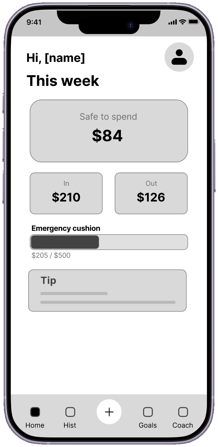
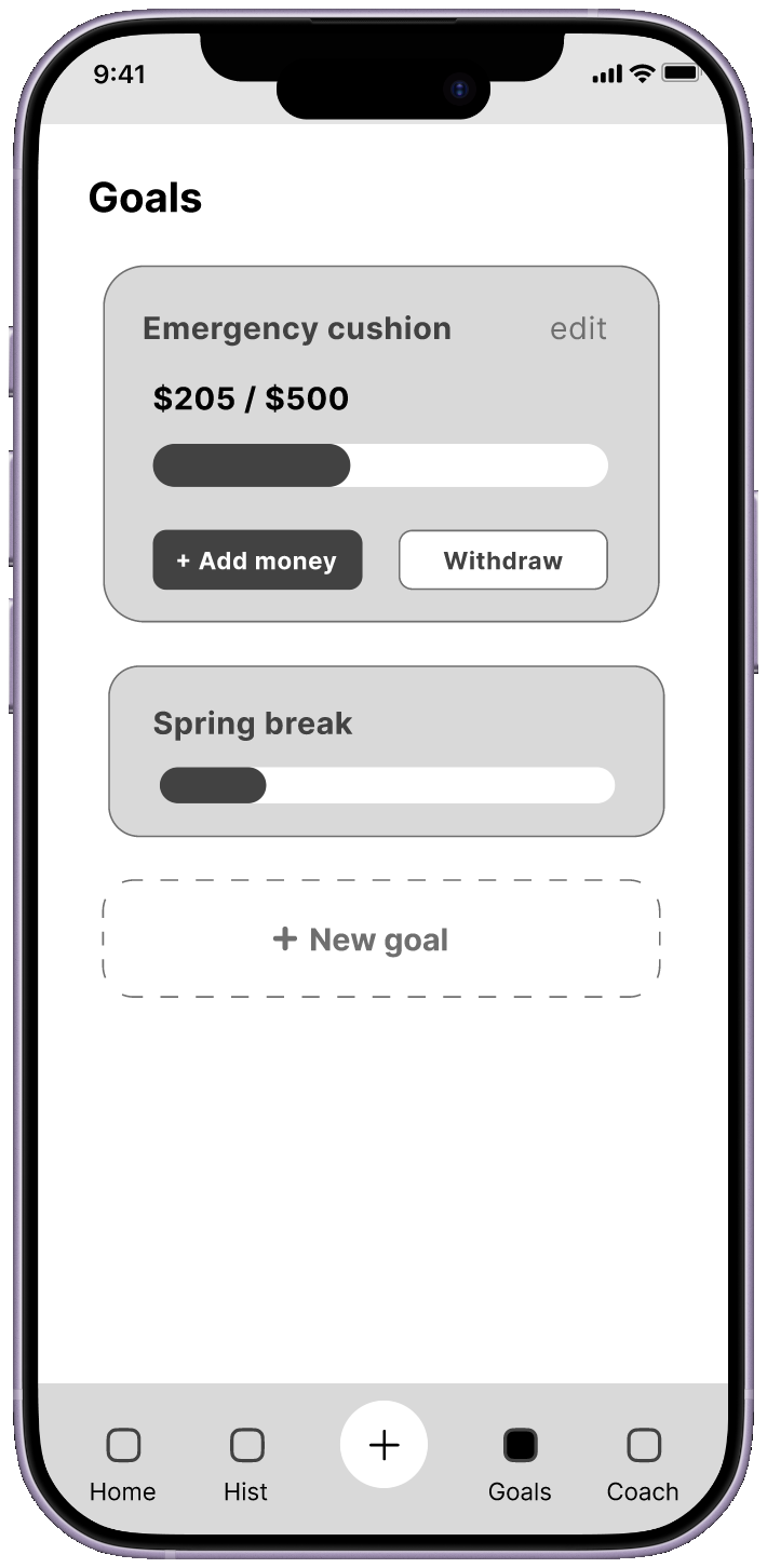
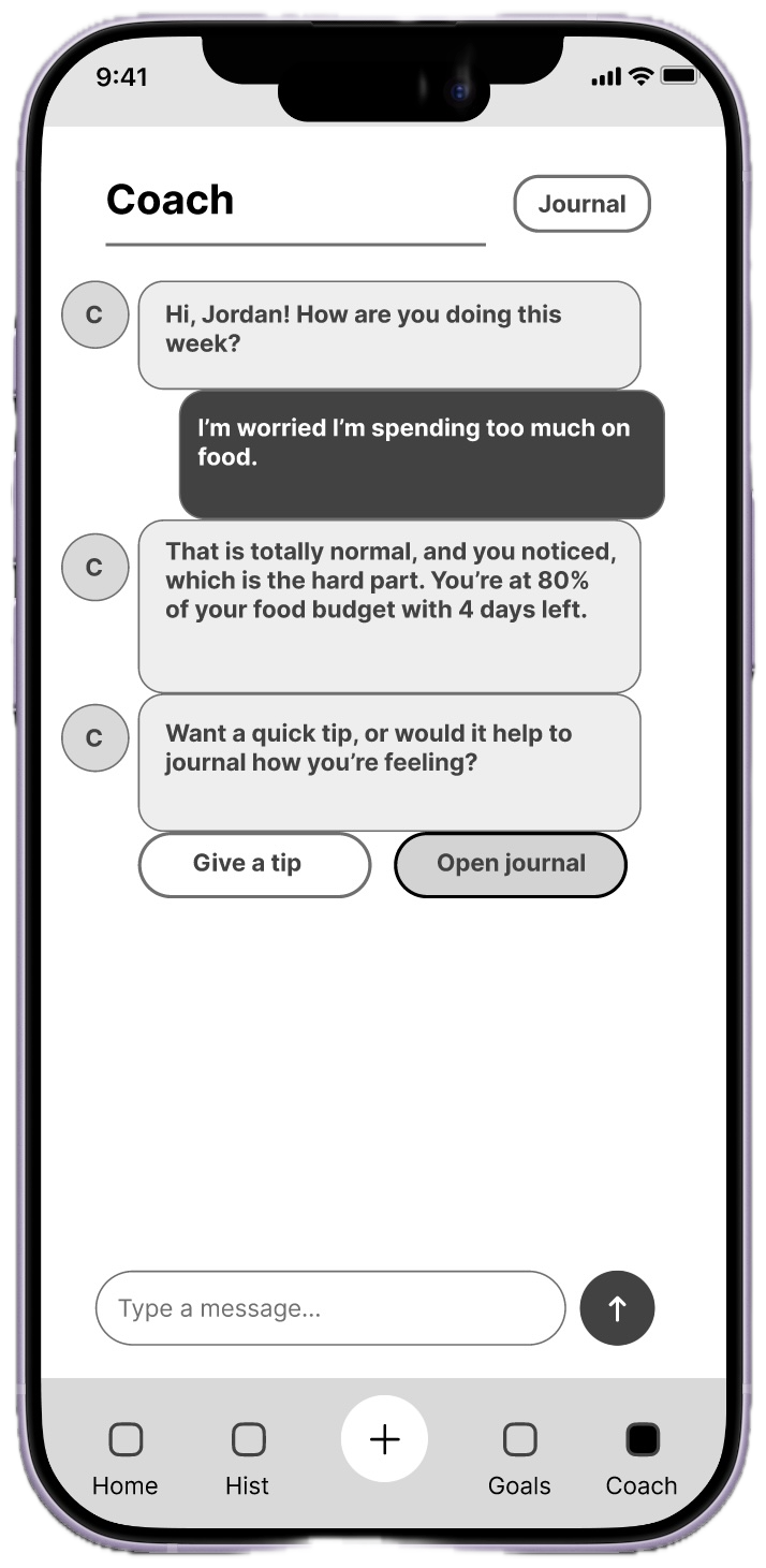
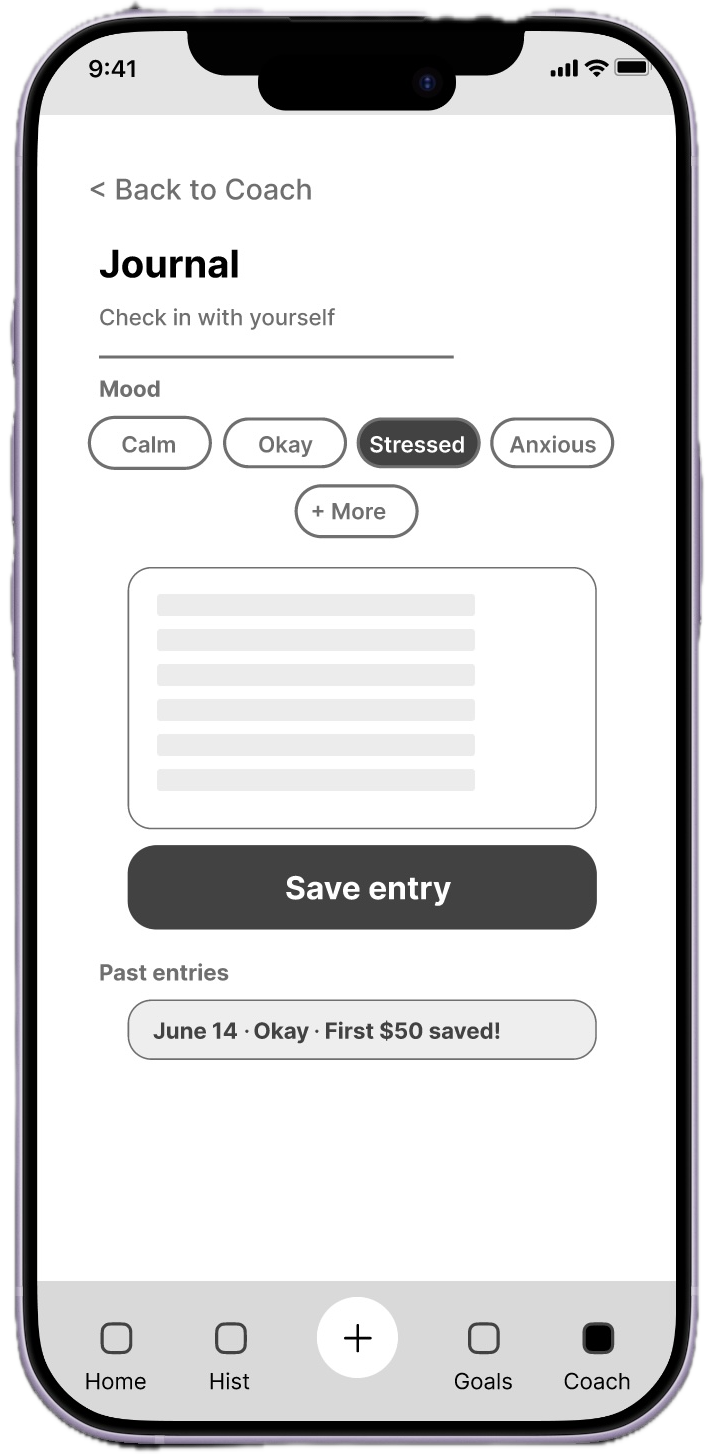
I ran three rounds of moderated usability studies with college-age participants. Round 1 tested a low-fidelity prototype; Round 2 tested the high-fidelity mockup; Round 3 tested the high-fidelity prototype.
These three rounds are the ones that most shaped the design, but testing didn't stop there. Usability testing is an ongoing process that doesn't end at launch, I've continued running rounds through the working prototype and into the live product.
One participant, Kate (23), said "Goals" felt like it was only for savings, she expected to find her food budget there too.
A single list of savings goals with separate "Add money" and "Withdraw" buttons on every card, cluttered, and no place for budgets.
Split into clear Savings and Budgets sections, plus a "What's your goal?" type-picker when creating anything new.
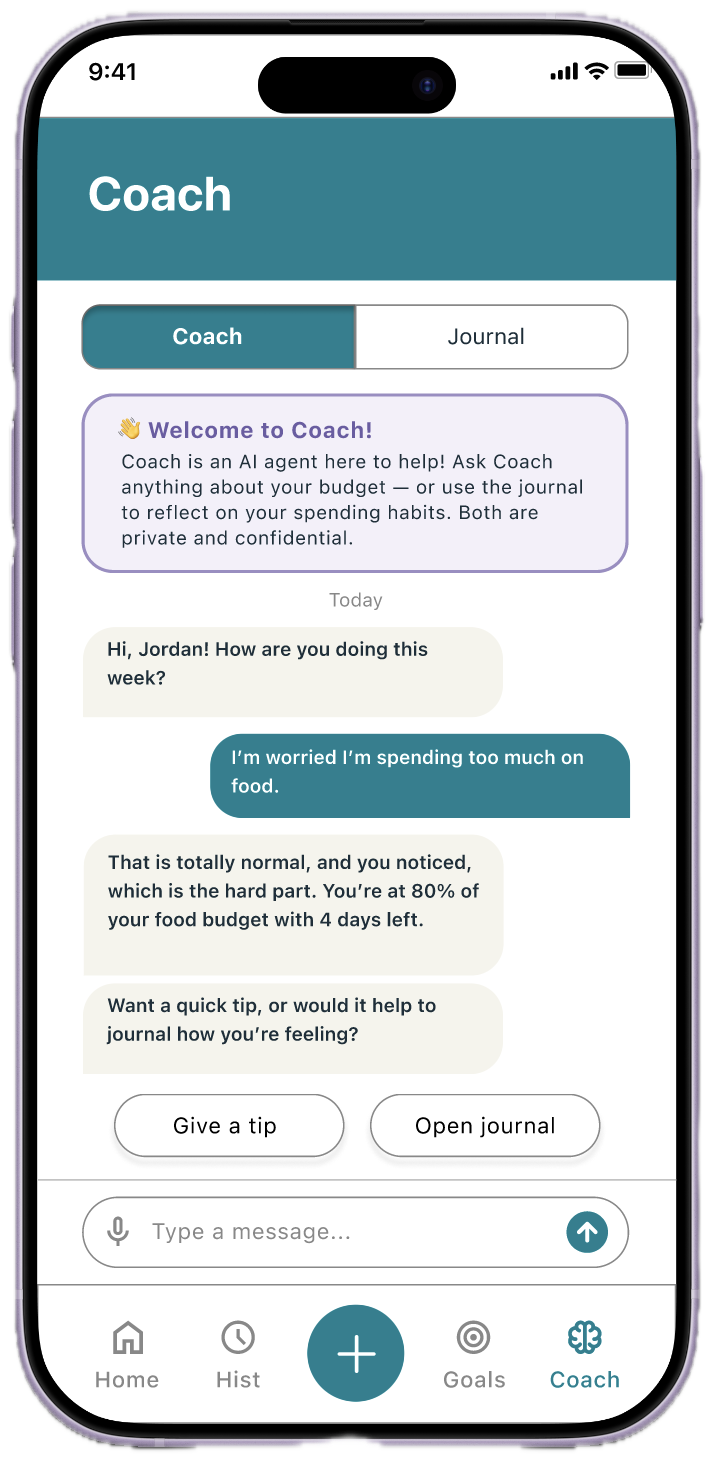
Another participant, Marina (21), noted the orange/yellow "Tip" on the homepage and the "Welcome to Coach" on the coach page felt like a warning, not a helpful info card.
Warm orange/yellow info cards read as alerts, making users hesitant about a feature meant to feel supportive.
Switched to soft purple to signal "informational," shifting perception from "something is wrong" to "this is helpful."
Orange "Tip" and "Welcome to Coach!" boxes read as warnings.
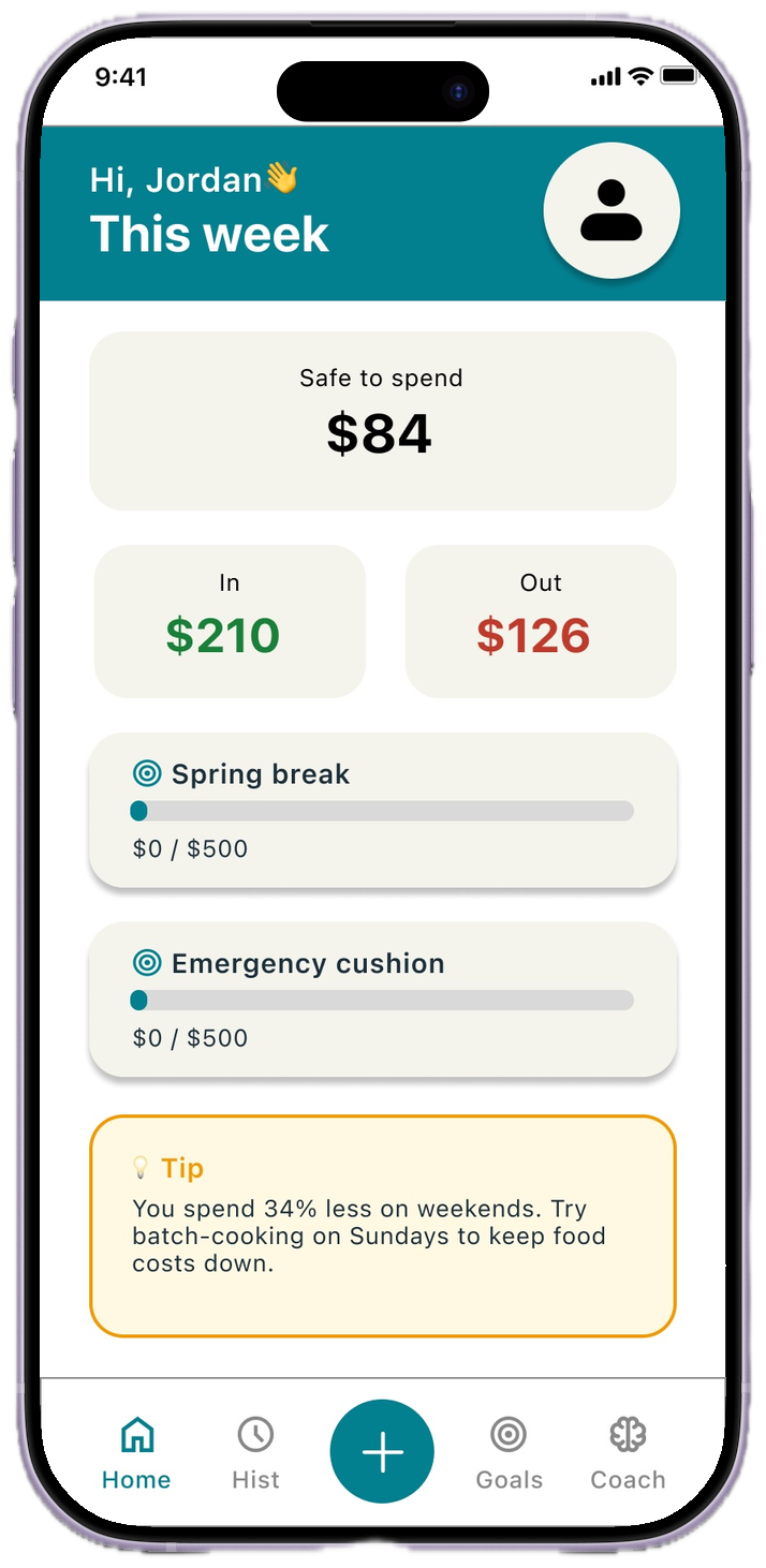
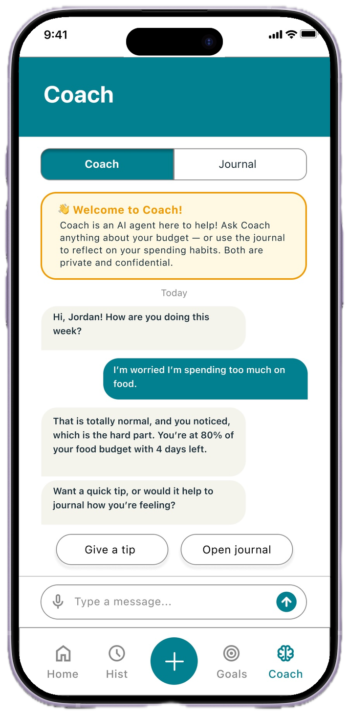
Switching the "Tip" and "Welcome to Coach!" boxes to soft purple makes them feel calmer and friendlier, reading as helpful rather than a warning.
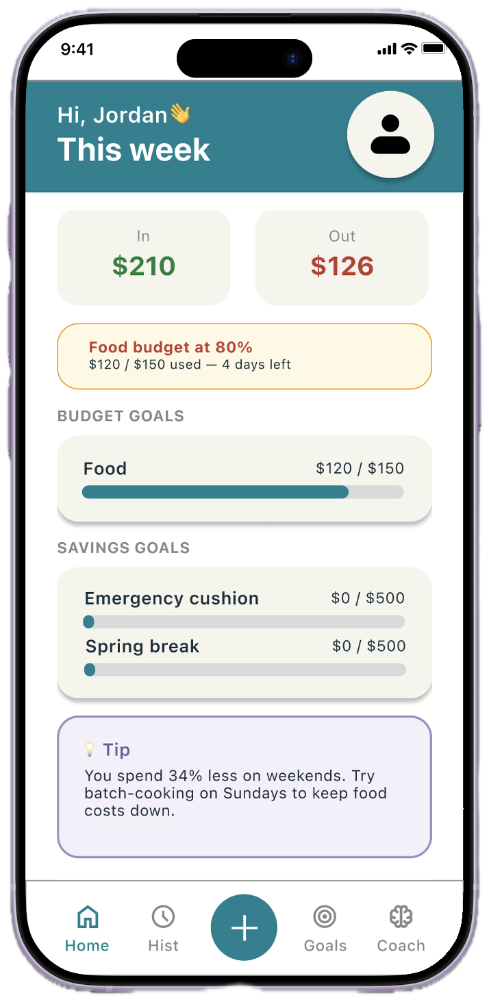
Color carries meaning beyond aesthetics...
A small shift from orange to purple meaningfully increased user confidence. See? Much more calming! This is where the psychology comes in.
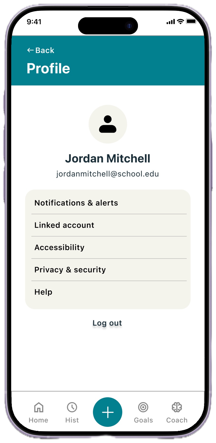
The polished prototype, post-usability revisions, an approachable home dashboard, unified Goals page, a friendlier Coach, and a reflective Journal.
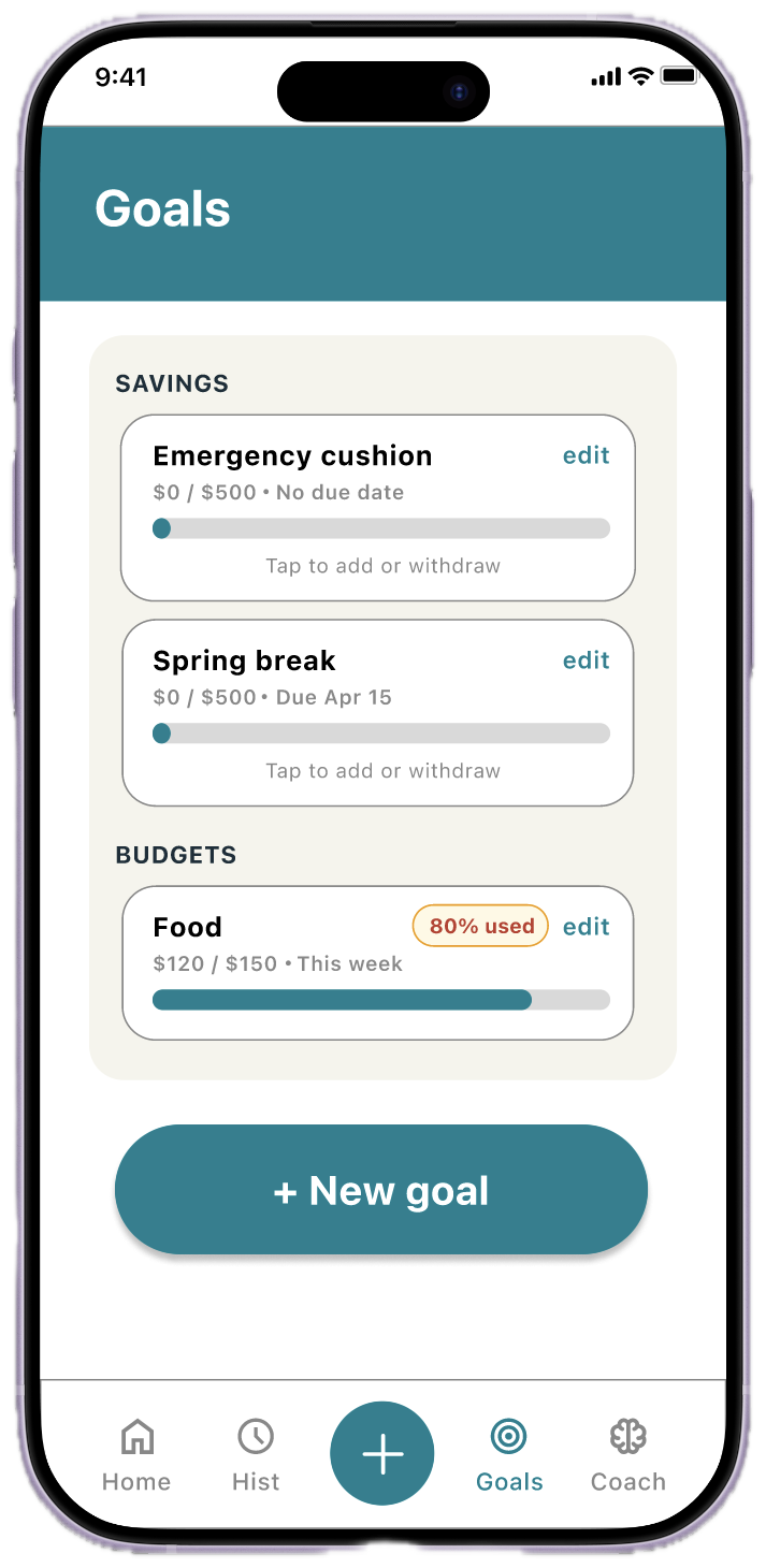
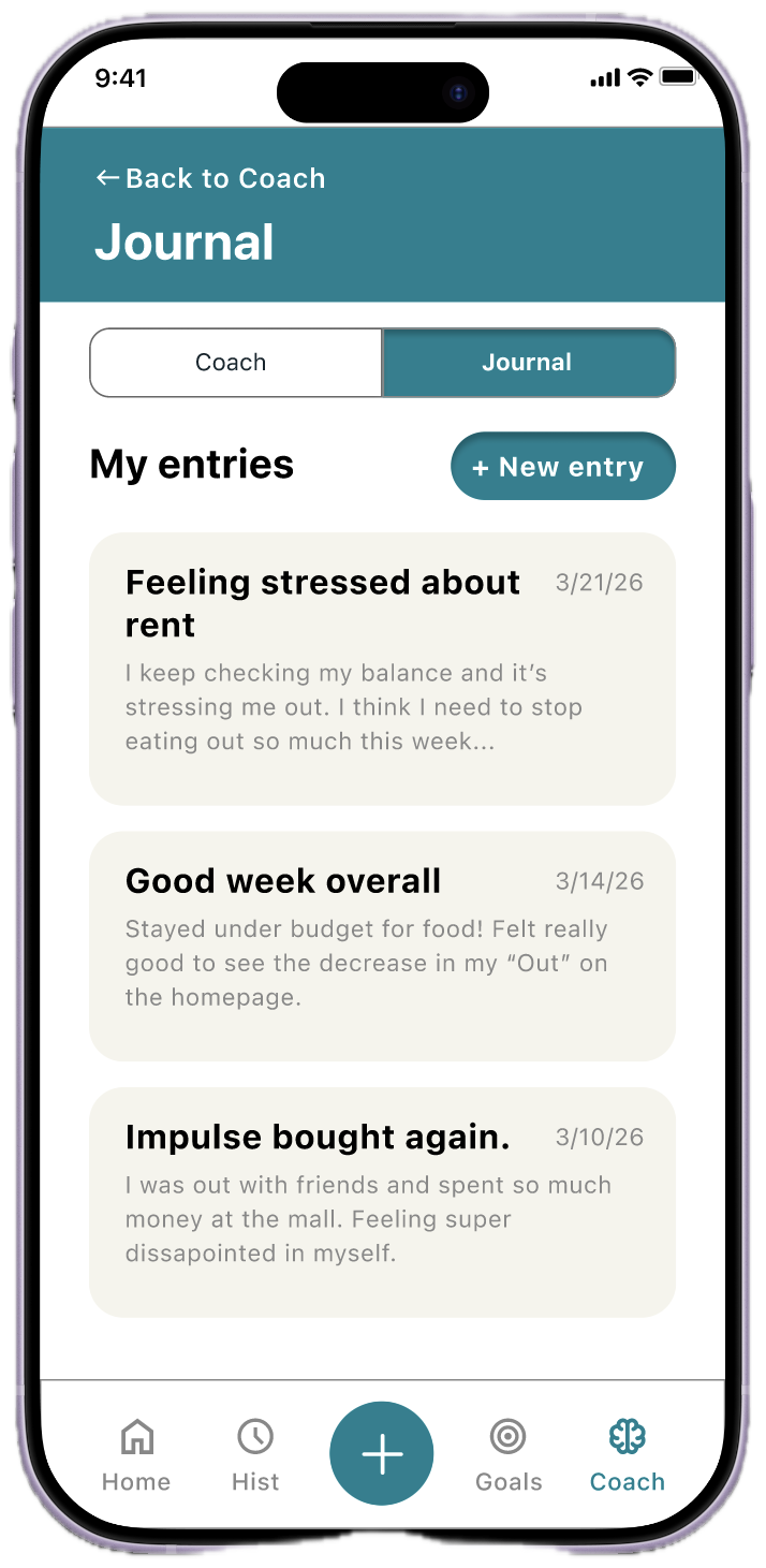
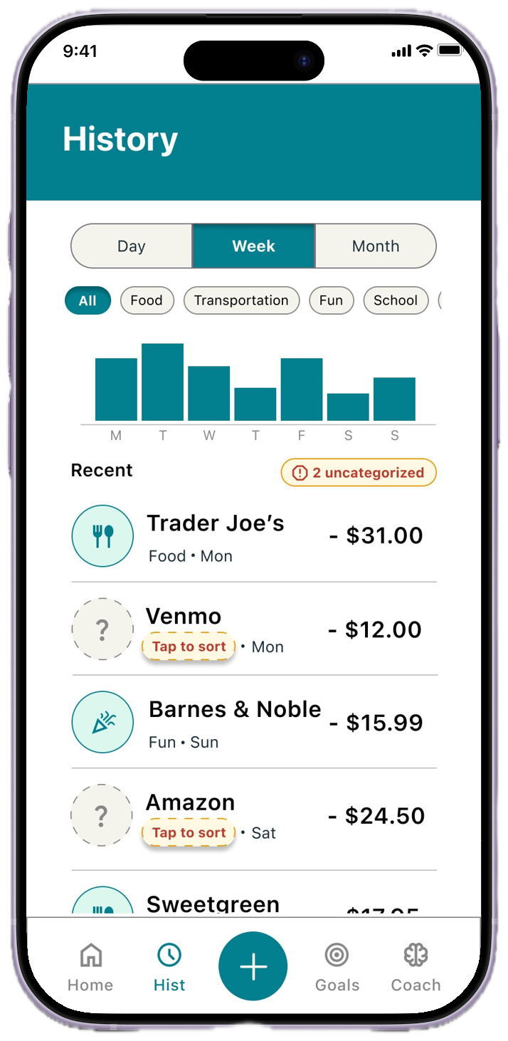
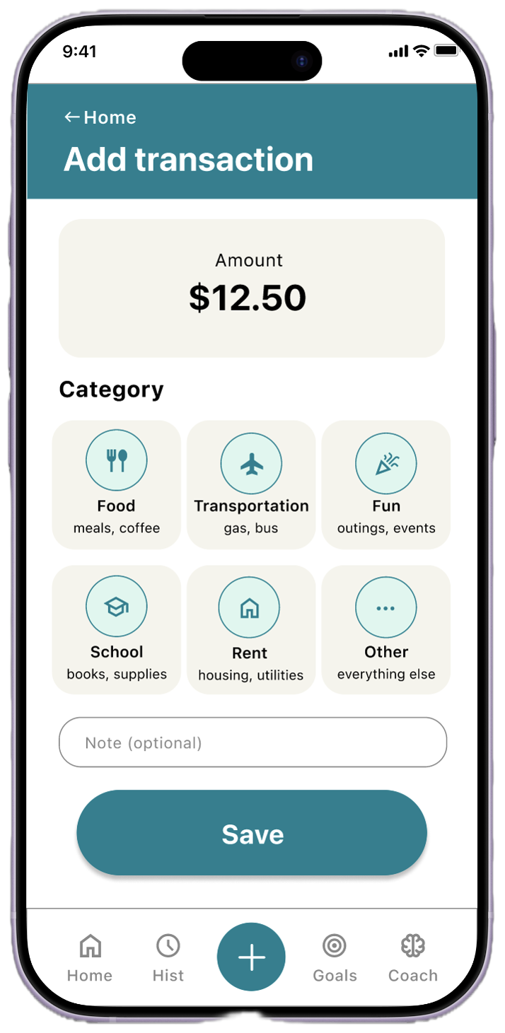
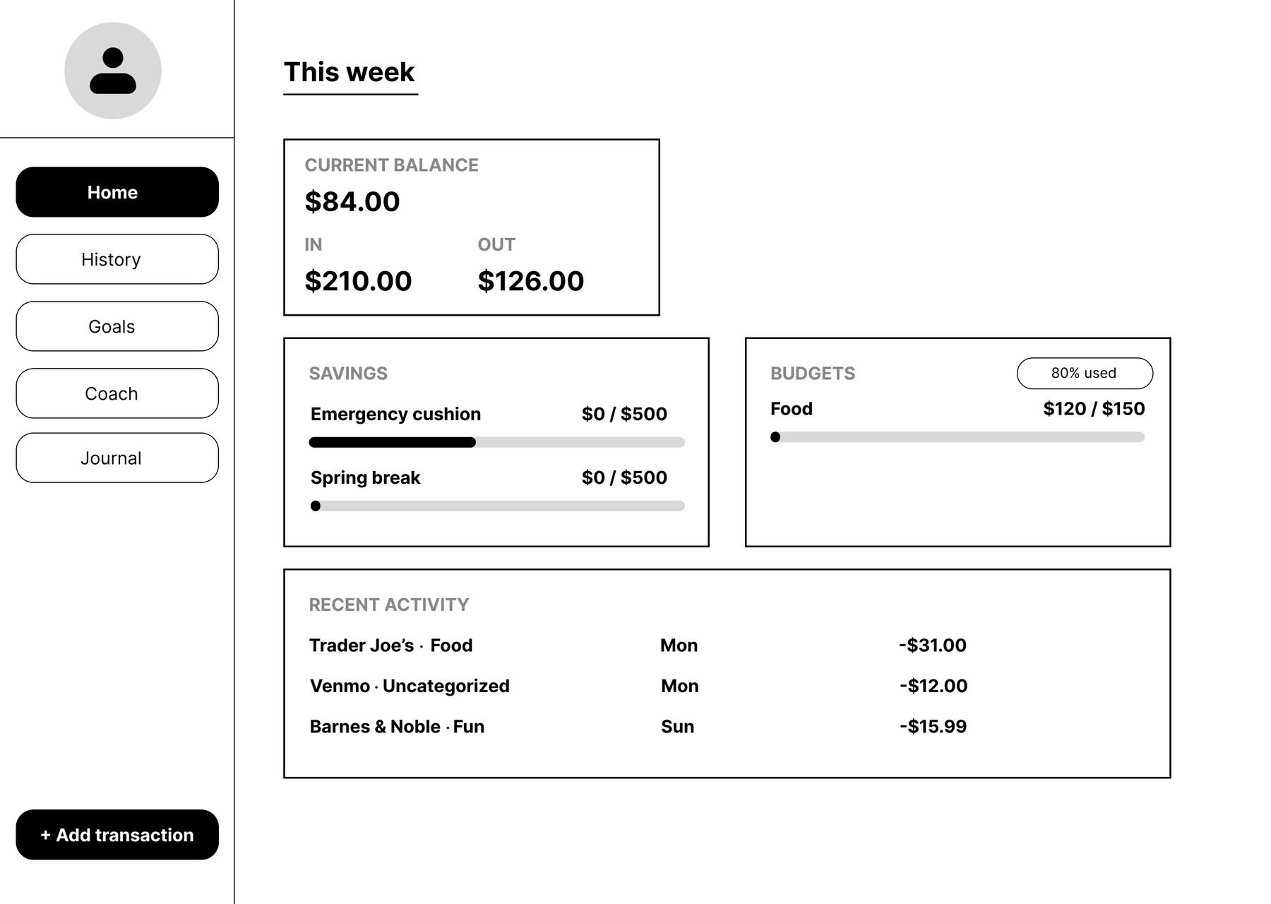
I adapted the core experience into a responsive web layout, reflowing the mobile navigation into a persistent sidebar and expanding the dashboard cards to make use of wider screens, while keeping the same information hierarchy and structure across breakpoints.
Building the responsive layout was also the turning point where I realized I wanted BFF to exist as a real product, not just a Figma prototype, but something people could actually use from the start.
Text uses high-contrast dark on light backgrounds; the primary teal is tested against WCAG AA, and white-on-teal passes AA for the large text sizes used.
Budget warnings pair color with descriptive text ("80% used, 4 days left") so colorblind users aren't excluded from critical information.
Every icon is paired with a text label, and a "?" tooltip on "safe to spend" explains it in-context, no prior financial knowledge assumed.
Beyond baseline compliance, a dedicated Accessibility panel under Profile lets people tailor the app to their needs: Larger text bumps the base size to 18px, High contrast strengthens borders and text, Reduce motion minimizes animations, and Dark mode eases eye strain at night. Building for accessibility helps everyone.
BFF launched publicly on the Apple App Store as a native iOS app, taking the project from a Google certificate concept all the way to a real product people can download and use. The responsive web version is fully built alongside it.
With BFF shipped, the roadmap continues: a bank-account linking flow to power the "safe to spend" calculation, and a more complete AI Coach with category-specific insights tied into the Journal.
The full set of Figma prototypes, from low-fidelity wireframes to the final high-fidelity mobile app prototype, and the responsive web adaptation:
Beyond the mockups, I built and shipped a fully functional version of BFF, with accounts, transaction logging, budgets, goals, and a journal. It is now a real, downloadable iOS app. You can also try the responsive web version or explore the original Figma prototype.