As the Marketing Technologist intern, I led the UX/UI redesign of the entire Neoclease site, reworking the information architecture, building a reusable visual system, and turning a busy template into a fast, accessible, responsive experience.
The problem: Neoclease is a gene-editing company with grants, press, and a Parkinson's program, but its site struggled to carry that weight. Pages were dense, dated, and broke on small screens, and its strongest proof points sat buried in a blog and lost in wall-to-wall text. For a company trying to win investors, partners, and talent, that was a real liability.
The solution: I rebuilt the entire site into a custom-coded, accessible, responsive experience that leads with the science, surfaces that credibility on the homepage, and unifies every page under a reusable visual system the team can extend themselves.
I worked page by page. Here's what the old site did, what I changed, and the UX reason behind it.
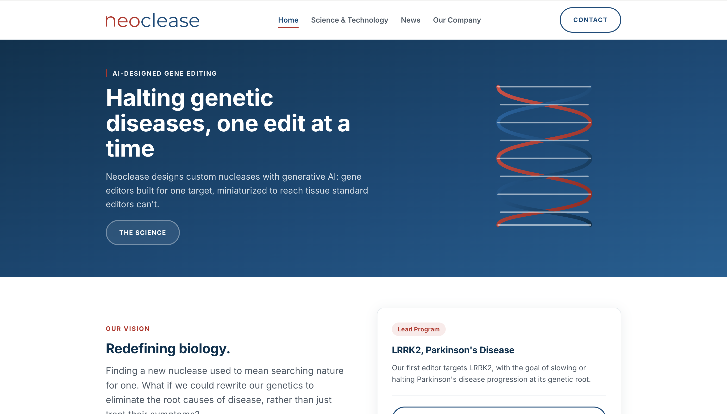
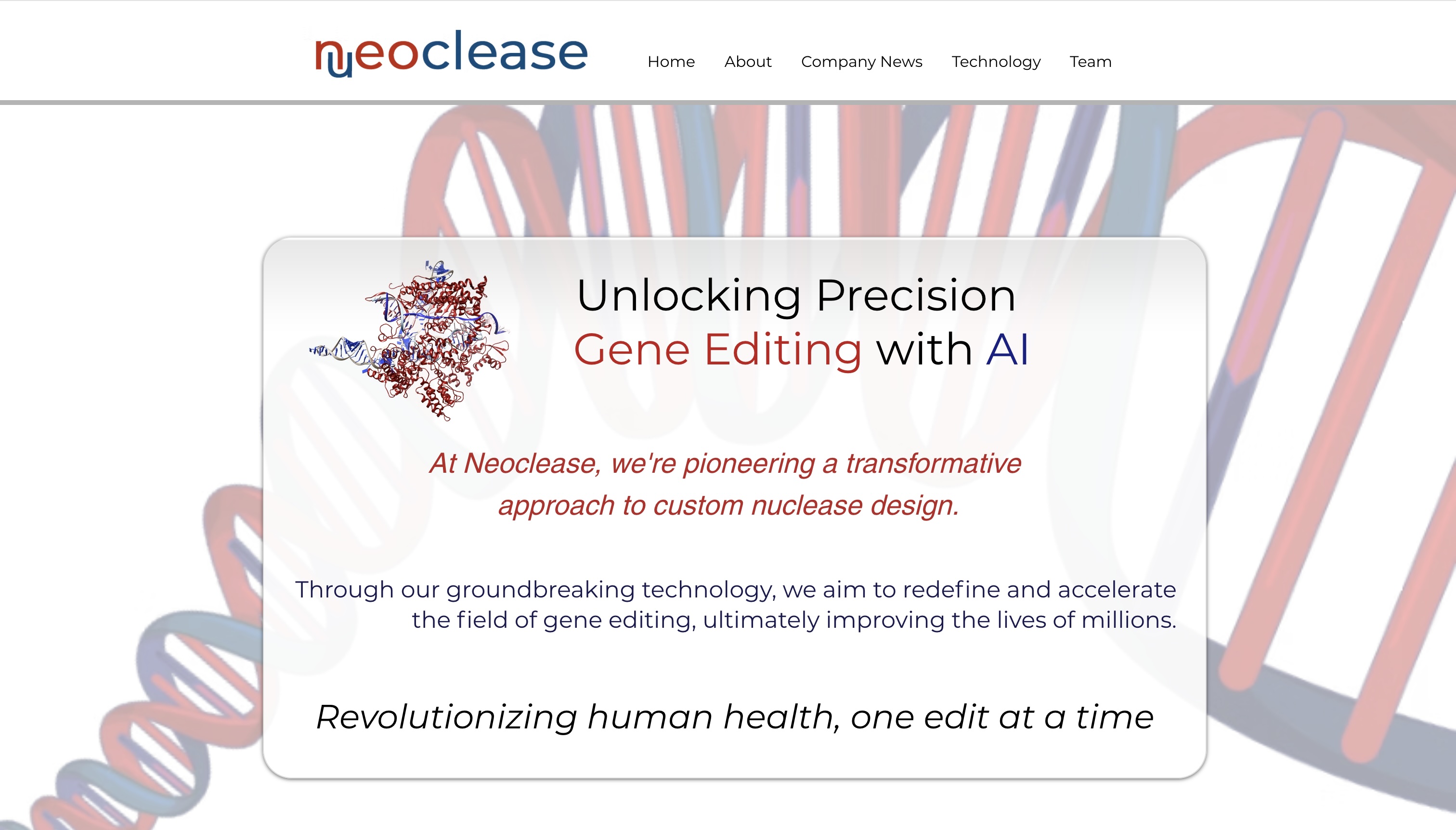
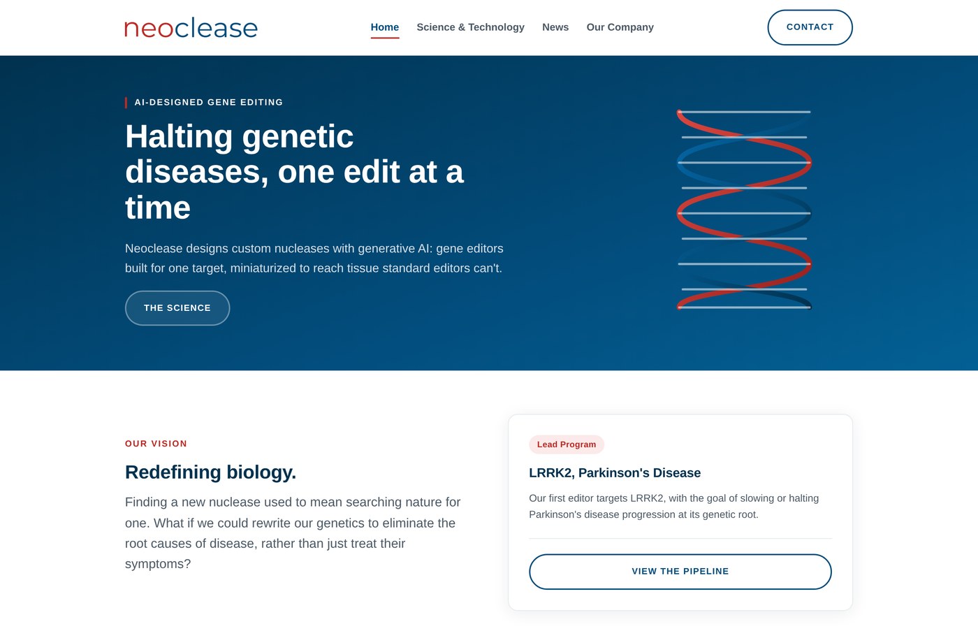
My goal was a homepage anyone could understand before diving into the science. I opened with a benefit-driven promise, “Halting genetic diseases, one edit at a time,” and surfaced the lead program (LRRK2 / Parkinson's) as a card high on the page, so the strongest proof point shows without scrolling.
Changes
I made the science scannable: three uniform cards, each with a short line and a bold data point, plus an interactive process visual and an embedded product video.
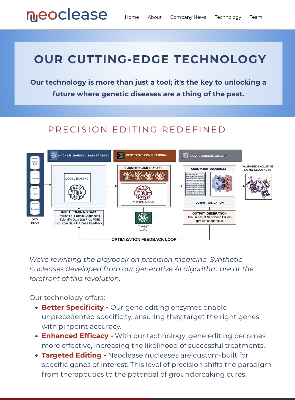
What it did: explained real differentiators, specificity, efficacy, targeting, but only in blocks of running text. Nothing was scannable and no data anchored the claims.
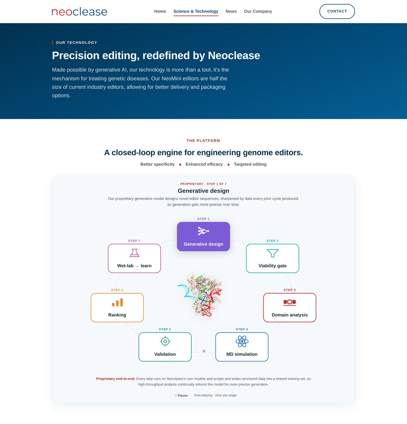
What I did: made the science evidence-led, three uniform cards with bold data points and a step-by-step platform visual, so the differentiators are legible at a glance.
Principle: comparison & consistency. Same eyebrow, one line of text, one bold data point each, so the eye compares them instantly.
Principle: show, don't tell. Large stat blocks (amino-acid class, PAM reach, identity to reference) turn “we're more precise” into visible evidence.
Principle: progressive disclosure. A step sequence replaces paragraphs describing how the platform works, making the pipeline legible at a glance.
Principle: keep the page calm. A “Watch a video” pop-up gives space to show the product in motion without cluttering the layout.
This is the actual interactive I built for the Science page, not a screenshot. It auto-advances through the platform's seven stages; pause it, or click any stage to read what happens there. Bringing it into the case study lets the pipeline explain itself.
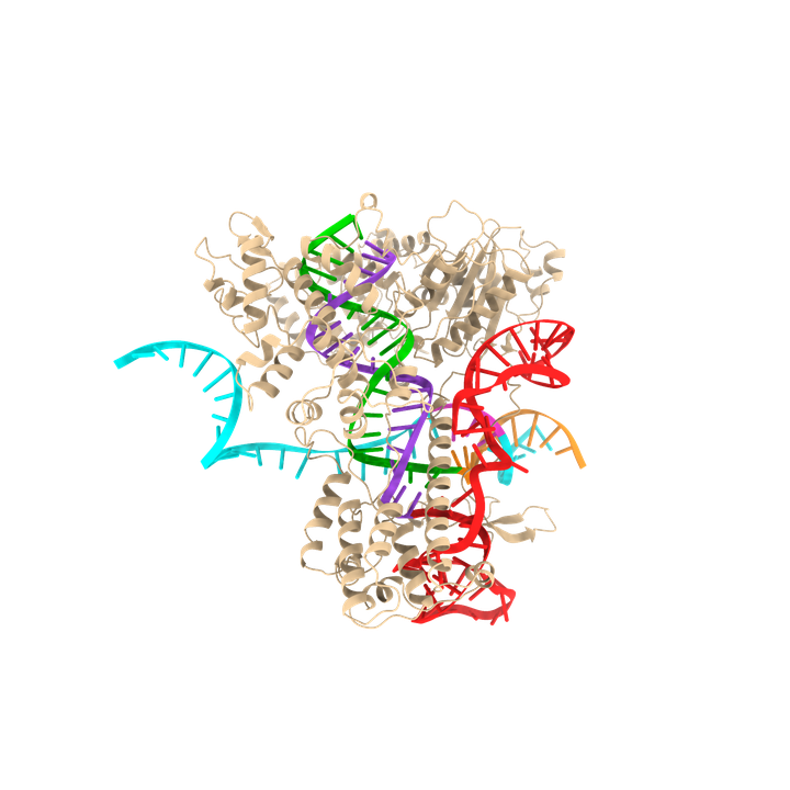
Proprietary end-to-end. Every step runs on Neoclease's own models and scripts and writes structured data into a shared training set, so high-throughput analysis continually informs the model for more precise generation.
I turned the blog into a branded News section, a grid of the six most recent items, templated article pages, and a “See past news” archive that kicks in automatically once there are more than six.
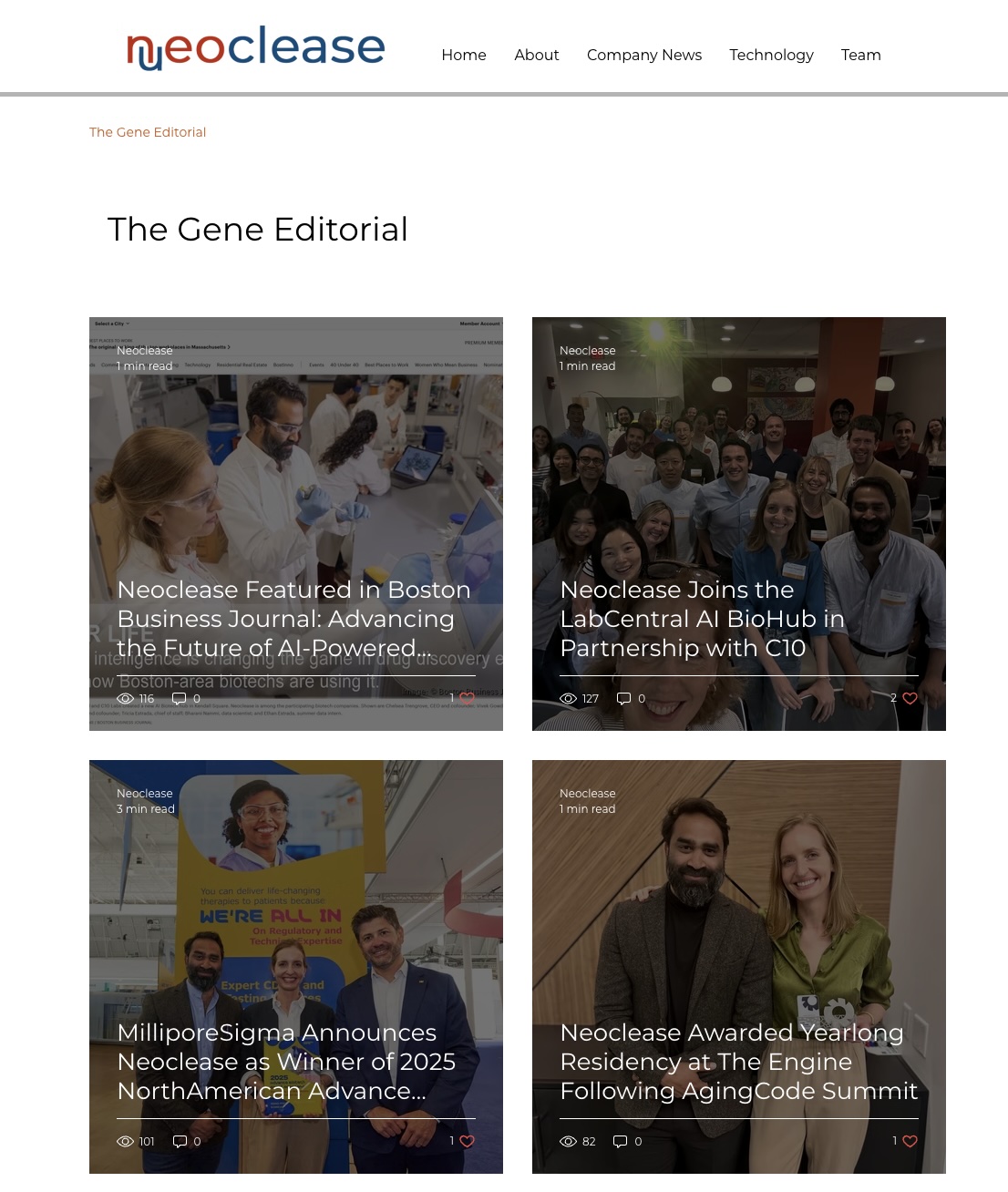
What it did: the company's strongest social proof, grants, prizes, press, lived in a plain default blog, invisible from the homepage.
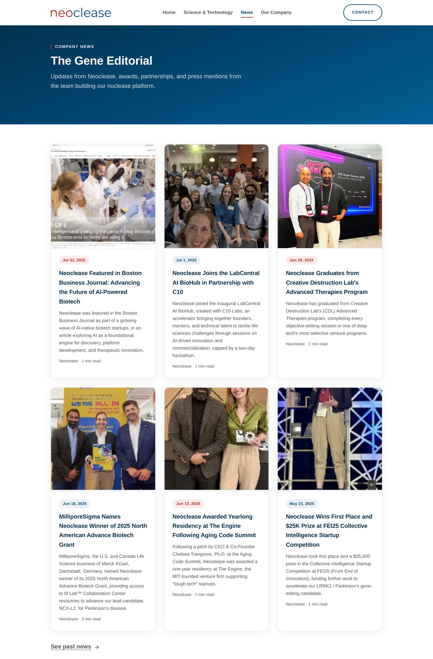
What I did: built a six-newest card grid with dates, templated article pages, and an automatic “See past news” archive so the page stays strong as posts accumulate.
The company's strongest social proof used to live in a disconnected blog, invisible from the homepage. A six-newest grid with automatic archive overflow keeps the page strong as posts accumulate, and adding a post is now a repeatable, documented step rather than a page-builder chore.
About and Team were two overlapping pages of text. I merged them into one Our Company page that opens with the team's values, so the people and the mission behind the science come through, then moves into a clean leadership grid.
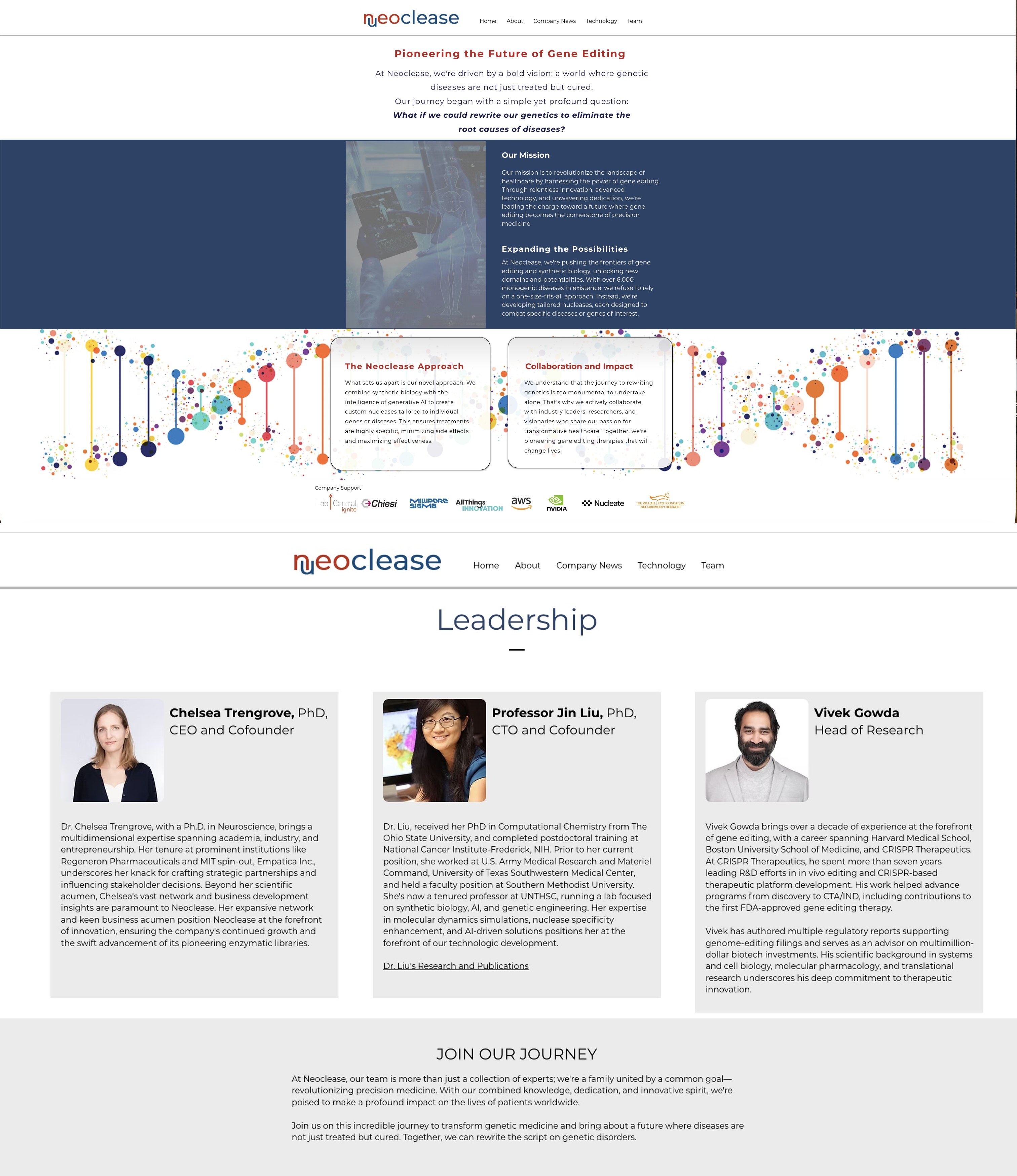
What it did: split the company story and the people across two text-heavy pages that repeated each other and didn't match the rest of the site.
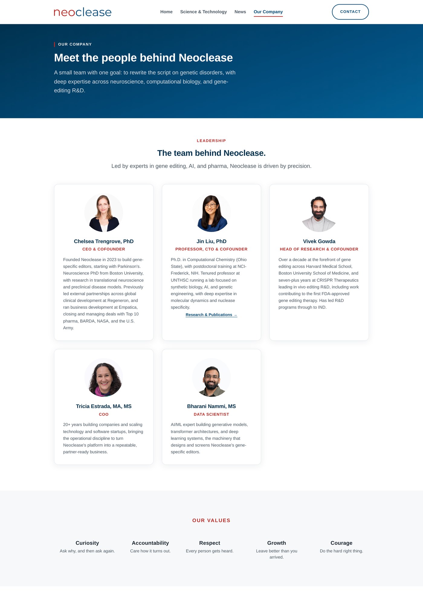
What I did: merged About and Team into one Our Company page. It opens with the values that guide the team's mission, a reminder that there are people behind the science, then moves into a consistent leadership grid that keeps each founder's credentials front and center.
Principle: consistency. The same persistent navigation bar and mobile menu appear on every page, so the layout and wayfinding never change from one page to the next. That consistency is what makes the separate pages read as one coherent product instead of a set of disconnected documents.
Contact is the one action I wanted reachable from anywhere, because the whole reason the site exists is to get people to reach out. The old site never put Contact in the navigation at all, so the only way to find it was to scroll to the bottom of a page and hope it was there. I gave it a standing place in the nav on every page and still closed each page with it, so reaching the team is never more than a glance away. Every one of these choices was deliberate.
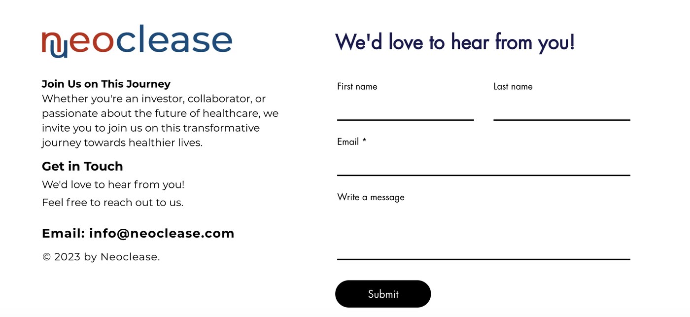
What it did: the old site had no Contact link in the navigation at all. The form lived in the footer, so the only way to reach it was to scroll to the bottom of a page and hope to find it.
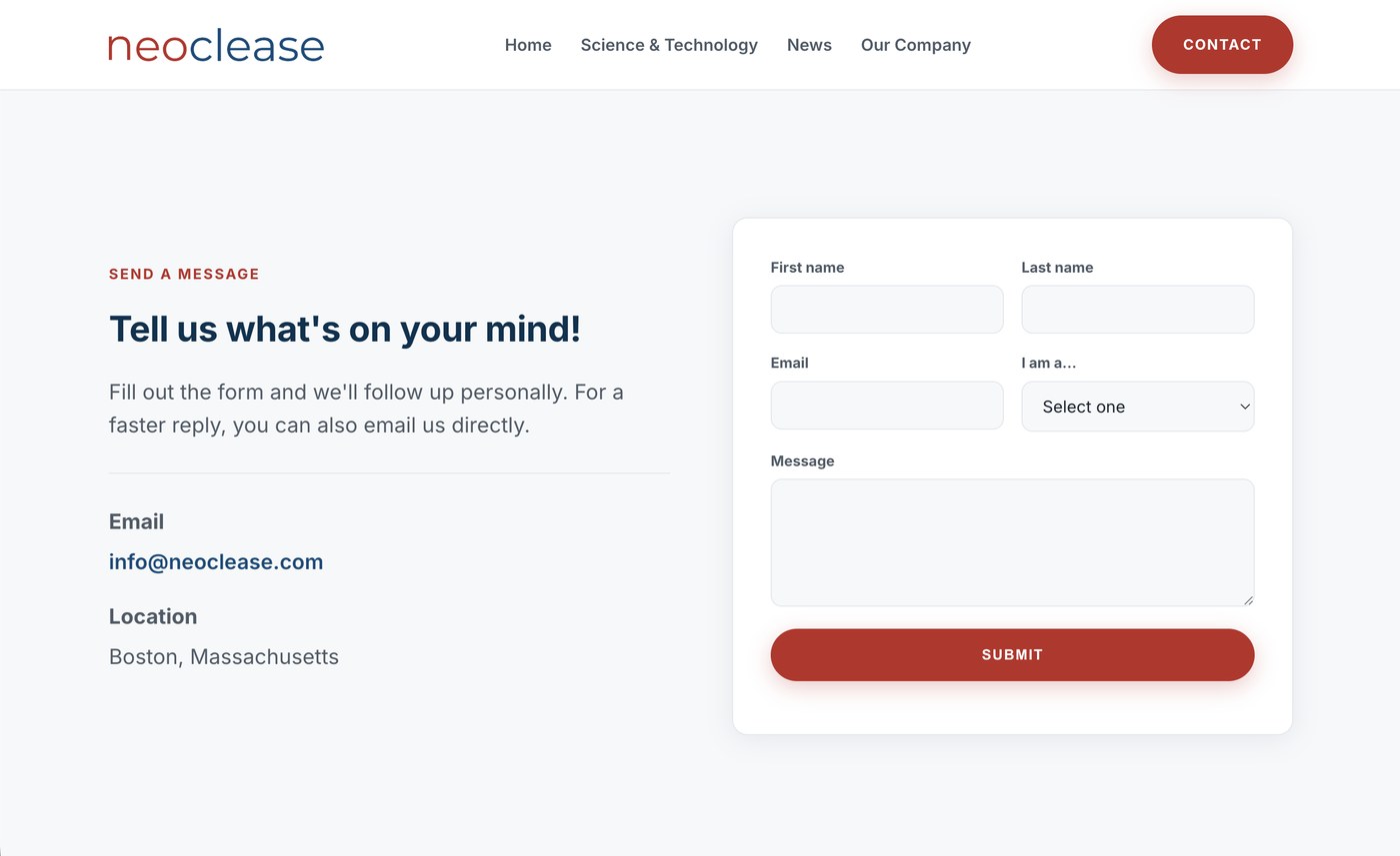
What I did: gave Contact its own page, reachable from a bold red button in the nav on every page, and paired a short form with a direct email so reaching out is effortless.
Principle: persistent access. Contact lives in the navigation on every page and closes every page with a “Get in Touch” banner, so the next step is always one tap away no matter where someone is or how far they have scrolled.
Principle: visual emphasis. Where the old site hid Contact in the footer, I set it apart from the other links, farther right and in bold red as a button rather than plain text, so the primary action reads as the primary action instead of sitting flat among the navigation.
Principle: visibility of system status. The nav highlights the current page and section as you move, so people can identify their position on the site. On the old site nothing signaled where you were, so this was a deliberate change to keep people oriented.
Principle: reduce friction. Because every path ends at the same warm Contact action, there is never a question of how to reach the team, which is exactly what a site built to start conversations should do.
The old site was styled page by page, so nothing matched. I rebuilt it on the three foundations of visual design, typography, color, and iconography, defining each as a reusable token and coding them once in shared CSS. That is what gives every page a uniform style, and it lets the team add a page by reusing components instead of restyling from scratch.
Before any of that, I started with the logo. The original wove a DNA strand into the first letter. The idea was creative, but in practice the strand read as an extra character, so people saw “Nueoclease,” misspelled the name, and searched for the wrong thing, which surfaced misleading results and buried the real company. I redesigned the wordmark to keep the brand's navy and red but remove the DNA element, so the name reads exactly as it is spelled.

Why it matters: a name people can read is a name they can find. Removing the ambiguity fixed misspelled searches and misleading results, and kept the brand recognizable everywhere it appears, from the header to the favicon.
The old pages mixed template fonts at similar sizes, so nothing signalled what to read first. I set the whole site in one highly legible typeface (Inter) on a defined type scale, using weight and size to build a clear typographic hierarchy, so every page has an obvious first, second, and third read.
Template defaults at near-identical weight and size. Headings and body barely differed, so the eye had no clear entry point.
A single typeface on a fixed scale (eyebrow, heading, body) with weights 400–800 doing the ranking. Reading order is obvious at a glance.
I built the palette on the 60-30-10 rule: a dominant neutral, a supporting tone, and one accent. Navy carries structure and trust, a soft tint handles backgrounds, and signal red is reserved for a single job, the primary action. Holding the accent to one role turns color itself into a wayfinding cue: red always means “act here.”
60 · dominant. Structure, headers, trust.
30 · supporting. Section backgrounds.
10 · accent. Reserved for the primary action.
Depth on hero and footer.
Neutral base for content.
The old site leaned on mismatched stock graphics. I drew a single family of line icons at a uniform stroke and size and paired each with a text label, so icons reinforce meaning rather than decorate. A consistent icon language also makes repeated patterns, like a step, a stat, or a program, instantly recognizable across pages.
Assorted stock imagery and clip-art at different styles and weights, visual noise that added little meaning.
One line-icon set, uniform stroke and size, always paired with a label, used consistently in the process visual, cards, and nav.
Those foundations feed a small library of UI patterns: buttons that clearly look like buttons, pill tags, cards, and section layouts, built up from elements to components to full page templates. Because the system lives in shared CSS and coded templates instead of a page builder, adding or editing a page means reusing components rather than rebuilding styles.
Accessibility wasn't a pass at the end but shaped the visual choices from the start. The palette, the hierarchy, and the icon-plus-label pattern all exist partly so the site works for people with low vision, color-vision deficiencies, or a phone instead of a desktop.
The old site wasn't built for smaller screens. I rebuilt every layout to reflow from desktop to phone, so grids collapse to single columns, the navigation becomes a mobile menu, and tap targets stay comfortable. A lot of visitors arrive on a phone, and now the experience holds up wherever it opens.
Text and interface colors were checked for luminosity contrast against their backgrounds. Body and navy-on-white combinations clear the WCAG AA minimum of 4.5:1, so copy stays readable for low-contrast sensitivity.
Because red-green and other color-vision deficiencies are common, every colored cue is backed by an icon and a written label. Nothing is signalled by color by itself.
The product video plays in a clean modal with captions and playback-speed controls, so it works whether someone is reading along, deaf or hard of hearing, or wants to slow the explanation down.
Semantic headings give a clear order for assistive tech, the navigation highlights the current page and section so people always know where they are, the process visual respects prefers-reduced-motion, and everything is reachable and operable by keyboard.
The site is live across all five pages, built in code (HTML, CSS, and JavaScript) rather than a page builder. I developed it by pairing my web design and computer science background with AI assistance (Claude), writing and adjusting the markup, styles, and the logic behind the news archive, mobile navigation, and interactive visuals.
Every page opens with the promise and ranks the rest with a real hierarchy, so people find what matters fast.
WCAG-checked contrast, labels alongside color, and layouts that work from desktop to phone.
A custom codebase and reusable design system replace a locked template, so the team can extend the site themselves.
A site that once looked like a template now leads with the company's actual promise, makes the science legible, works for more people on more devices, and runs on a codebase the team owns end to end.